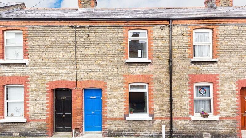
“People look at me as if I have 10 heads when I tell them that I made my house smaller,” says architect Joan McElligott, sitting in her two-up, two-down house in Stoneybatter, Dublin 7. But despite the counterintuitive design decision her home feels bigger than most such houses because of the way she manipulated spaces and recognised that the outdoor area was as important as the inside in the overall design.

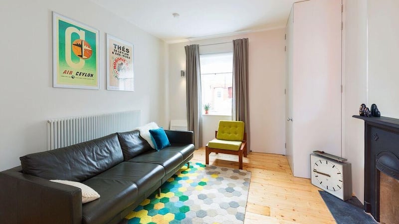
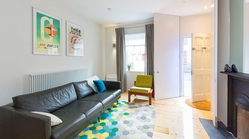
As was the way with these early 20th century brick cottages, the ceilings are lifted out of proportion with the floorspace (compared to current standards). McElligott used all 9ft of them in her design right from the entrance where a small lobby is enclosed by doors (by joiner Paul Fitzpatrick of Fitzpatrick & Henry Ltd ) that reach from ceiling to floor. All door heights and openings have been taken to such limits and the doors to the garden comprise a glass wall that folds open to lose the barrier between out and in. "The high doors emphasise the ceiling height and take away from the floor space," says McElligott, who runs her own architectural practice (joanmcelligott.com).
The aluminium framed doors to the garden – a commercial system by Reynaers Aluminium – was one of the “big ticket items” chosen by McElligott. On a limited budget, she “prioritised the fabric of the house and permanent items”,which also includes the tall radiators (from Merriott).
Although when she first viewed it she could see the house had potential and was a solid structure, it did need a full renovation.
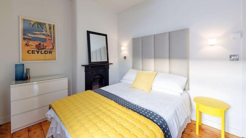
The first big decision she made was to move the stairs, which weren’t in their original place so that didn’t go against her ethos of staying in tune with the period of the house. The two upstairs bedrooms follow this traditional feel, albeit dressed with a sleek contemporary coat.

Her initial feeling about the house was that there was nowhere to sit, with the stairs plunging sideways into the living room and a 1970s extension taking up the whole garden. She took the stairs down the rear, side wall of the house and knocked the extension, replacing it with a wetroom beyond the kitchen. “Moving the stairs was the key to it [the whole design],” says McElligott, describing how it gave her the space to sit by the glass wall to the garden.
The kitchen was one of the budget decisions, being from Ikea, but the high white units fit the space perfectly and the grandness of its surrounds – those tall doors and impressive glass wall – trick you into thinking everything is of that ilk. The bookshelves also came from Ikea and, while she was having the tiled fireplace replaced by a cast-iron one, McElligott got Fitzpatrick to build out the fireplace wall to meet the shelves, making them appear built to fit (they also have a thin white frame around them to complete the trick). Also keeping costs in line was the decision to make the new stairs out of softwood rather than hardwood. Conversely she splashed out on salvaged hardwood flooring for the dining area to match the original boards in the living room.
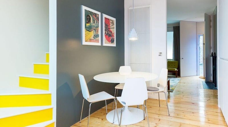
Because the quality of the softwood can’t bear bareness in McElligott’s eyes, the stairs have been painted – in a pop colour befitting its thoroughfare status.
As with everything in the house the palette is restrained. “You can’t put every idea in. Only one thing can be the feature and other things go in the background” – albeit bold: in yellow and orange, with grey as a calmer but strong grounding. Black (in the aluminium frame) and white (as a backdrop) play their usual supporting role.
The yellow had been successfully tested in her previous home. In choosing colours she recommends painting the samples onto sheets of paper rather than on the wall, and then moving them about.
The wall from the kitchen to the bathroom is in Tangerine Tango by Pantone and McElligott eschewed the convention of defining the door in a separate colour so it just reads as a large wall.
She used exterior paint in the dining room and on the slatted wall in the garden – Down Pipe by Farrow and Ball – living with the phenomenon that the colour looks different under artificial and natural light, a reminder that what looks like one tone in the paint shop could look a shade different in your home.
The garden is floored with stone slabs and has a wall of mirrors at the back – comprising tiles from Ikea pasted onto a board – creating a reflective space in more ways that one. Distinctive but flowing spaces is the theme throughout, for instance between the living and dining room with a half wall and floor-to-ceiling opening. “I didn’t want it all open-plan,” says McElligott. “There is enough wall there to feel the space is divided.”
The restrained framework with its star players works well – allowing for bold statements ,with pop colours, lofty glazed doors and a concrete lamp shade, that can sing while staying in harmony with the calmer elements.
“I’m delighted with it.” says McElligott. “It feels relatively spacious for the size of house and it all works.”


